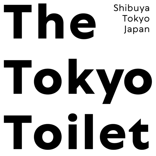

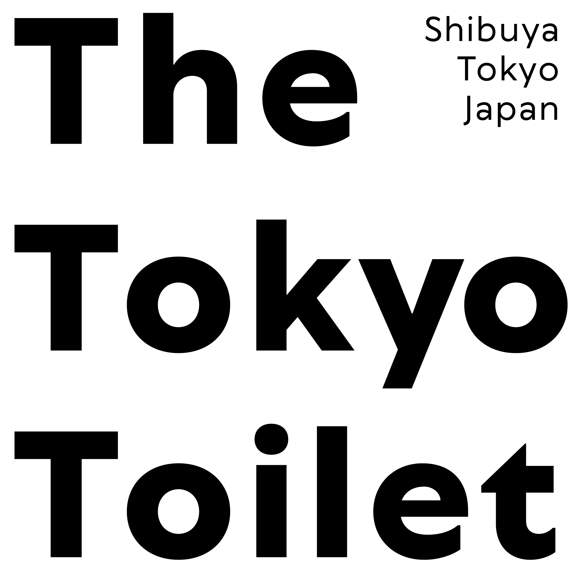
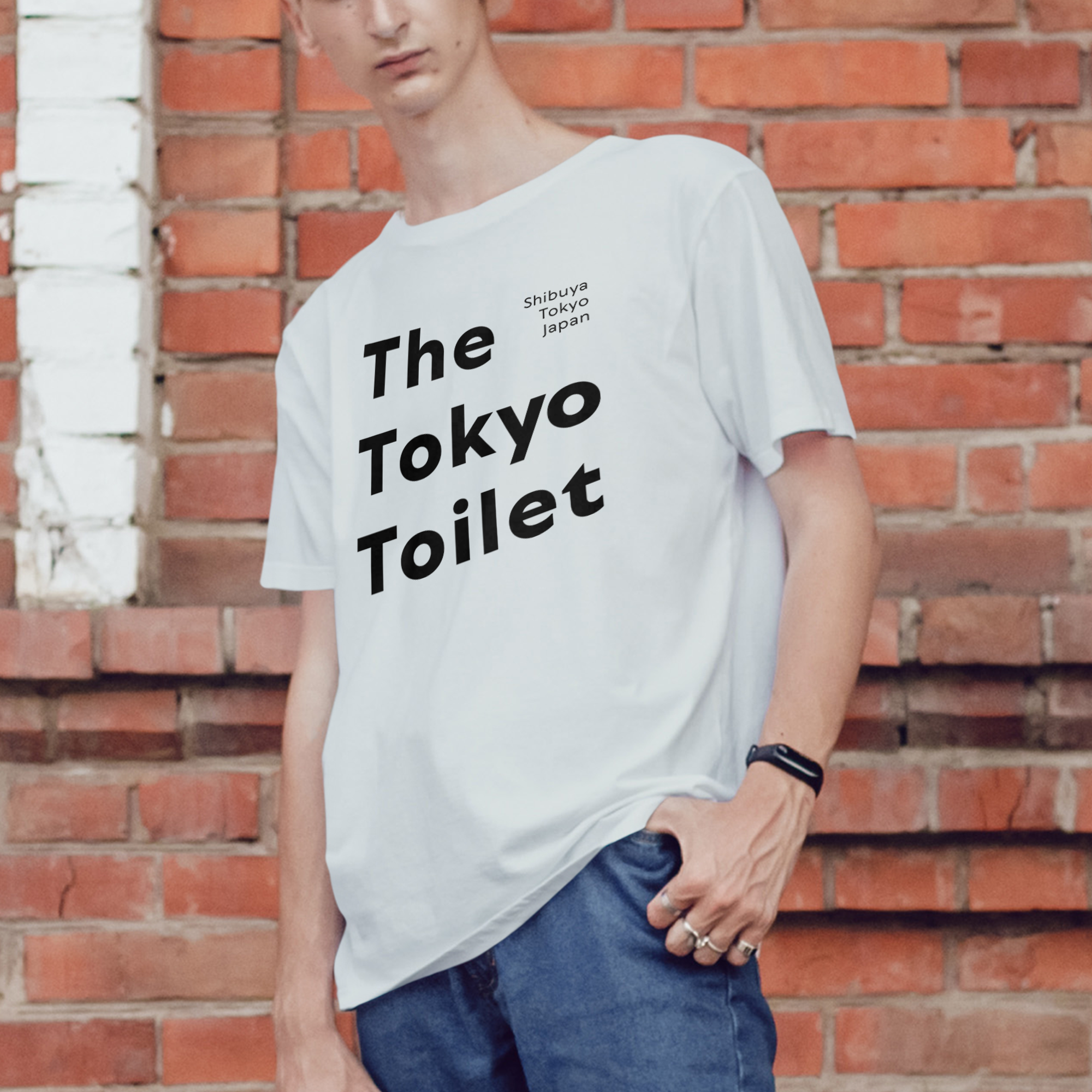
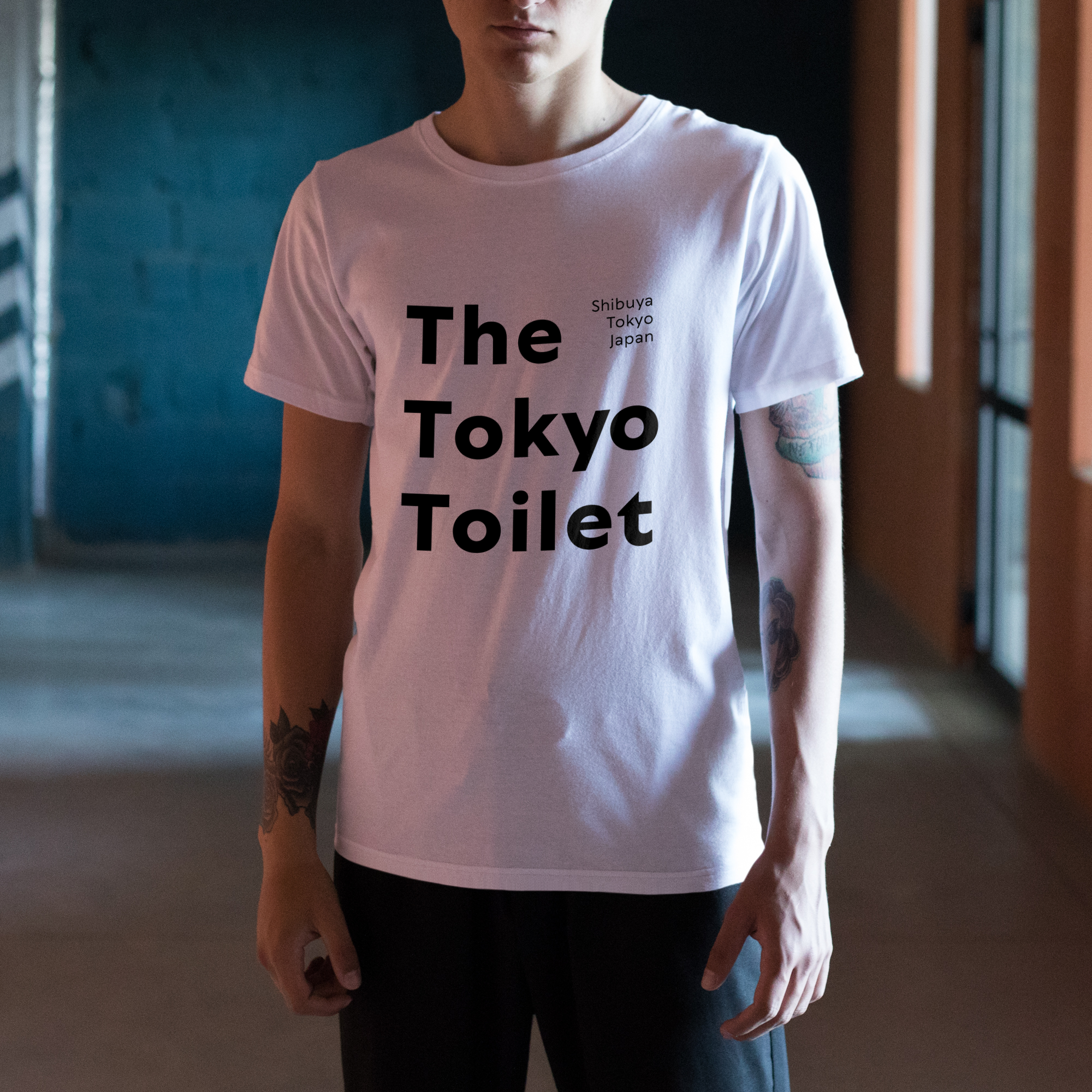
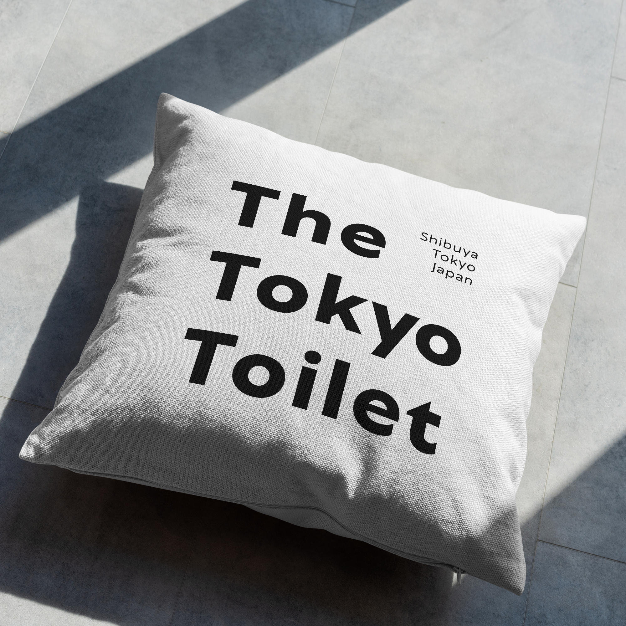
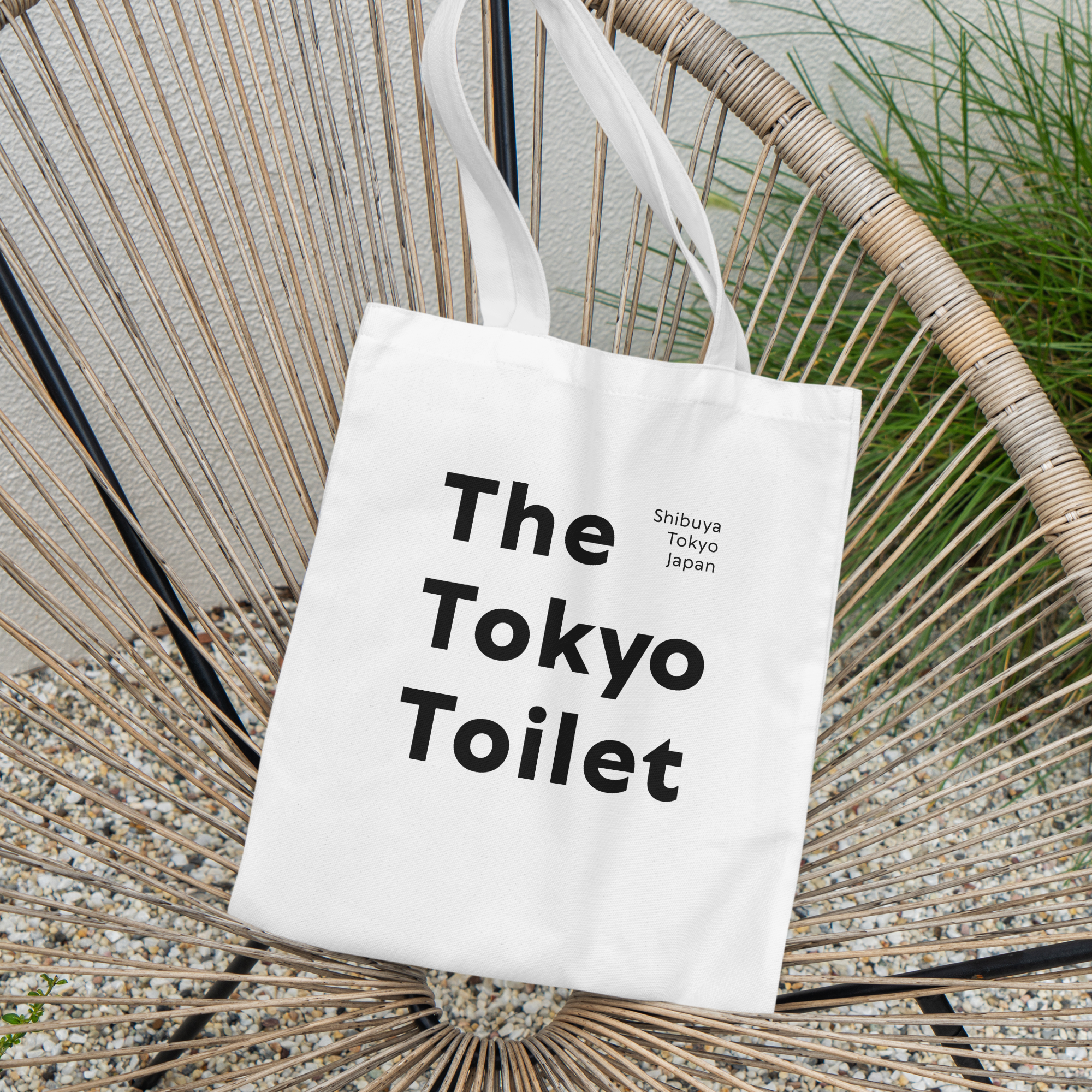
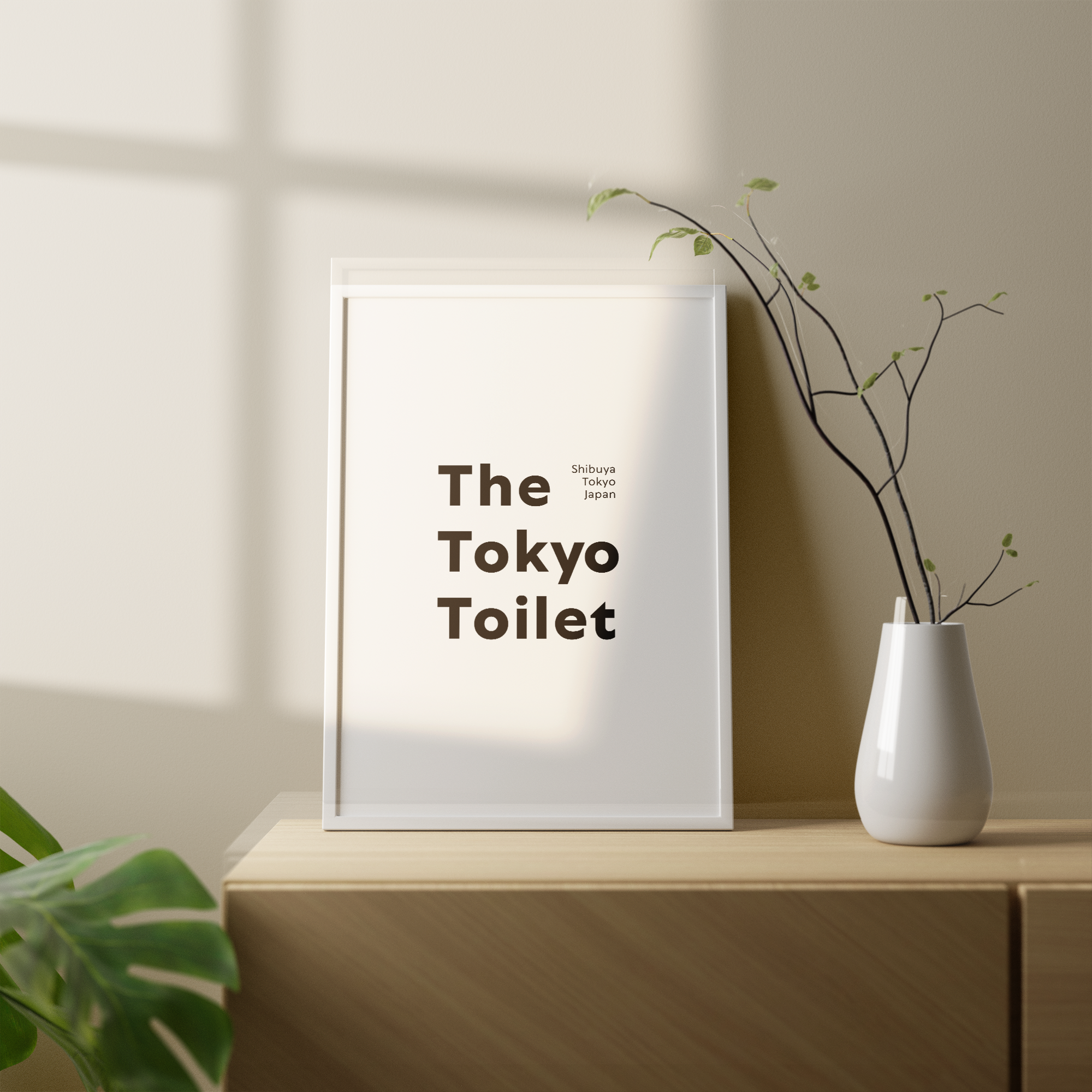
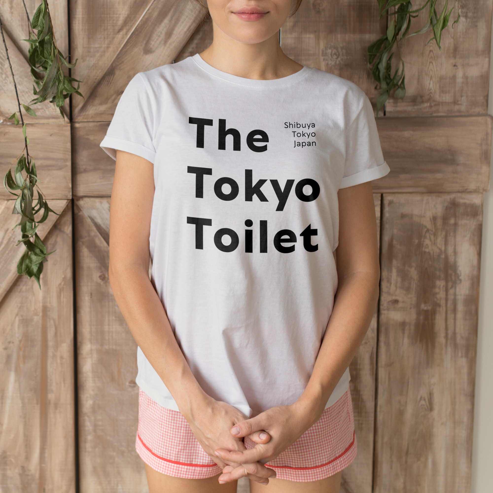
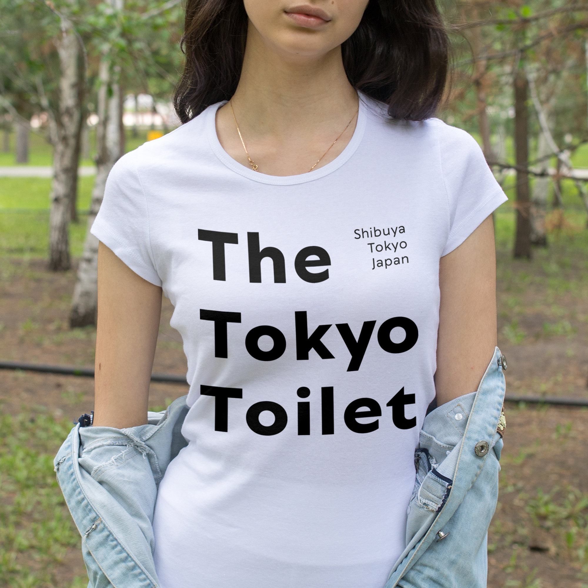
This square format design in the file THE-TO~1.PNG features a purely typographic and conceptual visual composition. The main layout is dominated by three large lines of left-aligned text that clearly read the words The Tokyo Toilet, written in a heavy, bold, and geometric sans-serif typeface. In the upper right corner, breaking the negative space in a balanced manner, a secondary text block appears much smaller and with a thin line weight, arranged vertically across three right-aligned rows that read the words Shibuya, Tokyo, and Japan exactly in that order. The color palette is strictly binary, minimalist, and high-contrast, composed solely of the solid black of the typography on a background intended to be transparent. The graphic style adopts the cleanliness, visual order, and sophistication of contemporary institutional and architectural editorial design from Japan. Visual effects focus entirely on scale shifts, contrasting line weights, and a dramatic use of negative space that lends lightness to an otherwise robust layout. This design is aimed at an audience interested in modern architecture, avant-garde Japanese design, Tokyo urbanism, and cultural travelers, making it an excellent theme for design environments, smart casual wear, or artistic decor in minimalist spaces. Due to its clean structure and impeccable corporate aesthetic, it is perfect for printing on print-on-demand products such as t-shirts, hoodies, posters, canvases, tote bags, stickers, and mugs.
The tokyo toilet shibuya design
This square format design in the file THE-TO~1.PNG features a purely typographic and conceptual visual composition. The main layout is dominated by three large lines of left-aligned text that clearly read the words The Tokyo Toilet, written in a heavy, bold, and geometric sans-serif typeface. In the upper right corner, breaking the negative space in a balanced manner, a secondary text block appears much smaller and with a thin line weight, arranged vertically across three right-aligned rows that read the words Shibuya, Tokyo, and Japan exactly in that order. The color palette is strictly binary, minimalist, and high-contrast, composed solely of the solid black of the typography on a background intended to be transparent. The graphic style adopts the cleanliness, visual order, and sophistication of contemporary institutional and architectural editorial design from Japan. Visual effects focus entirely on scale shifts, contrasting line weights, and a dramatic use of negative space that lends lightness to an otherwise robust layout. This design is aimed at an audience interested in modern architecture, avant-garde Japanese design, Tokyo urbanism, and cultural travelers, making it an excellent theme for design environments, smart casual wear, or artistic decor in minimalist spaces. Due to its clean structure and impeccable corporate aesthetic, it is perfect for printing on print-on-demand products such as t-shirts, hoodies, posters, canvases, tote bags, stickers, and mugs.
$6.00