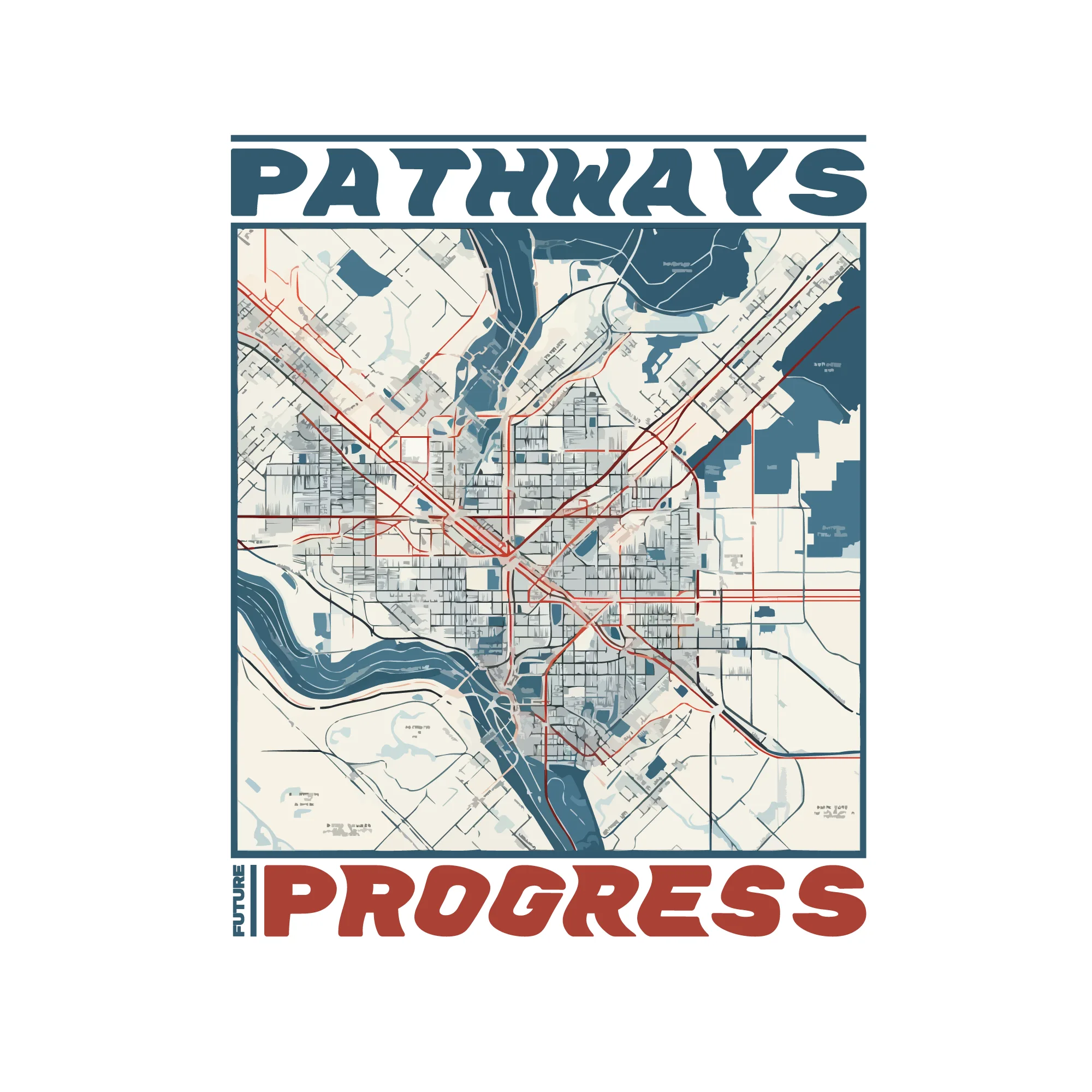
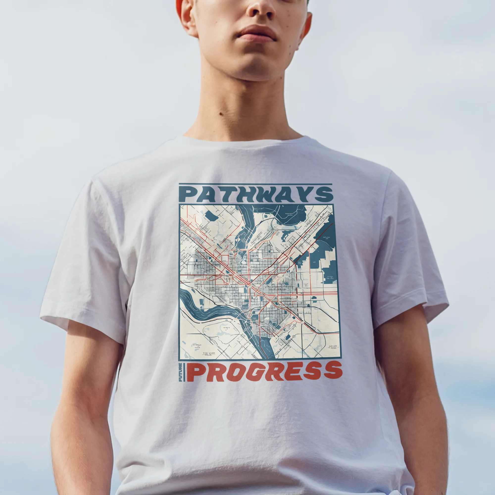
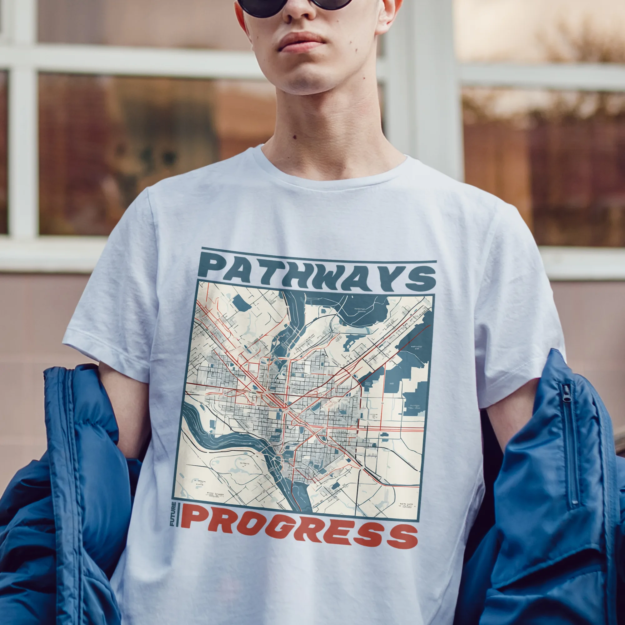
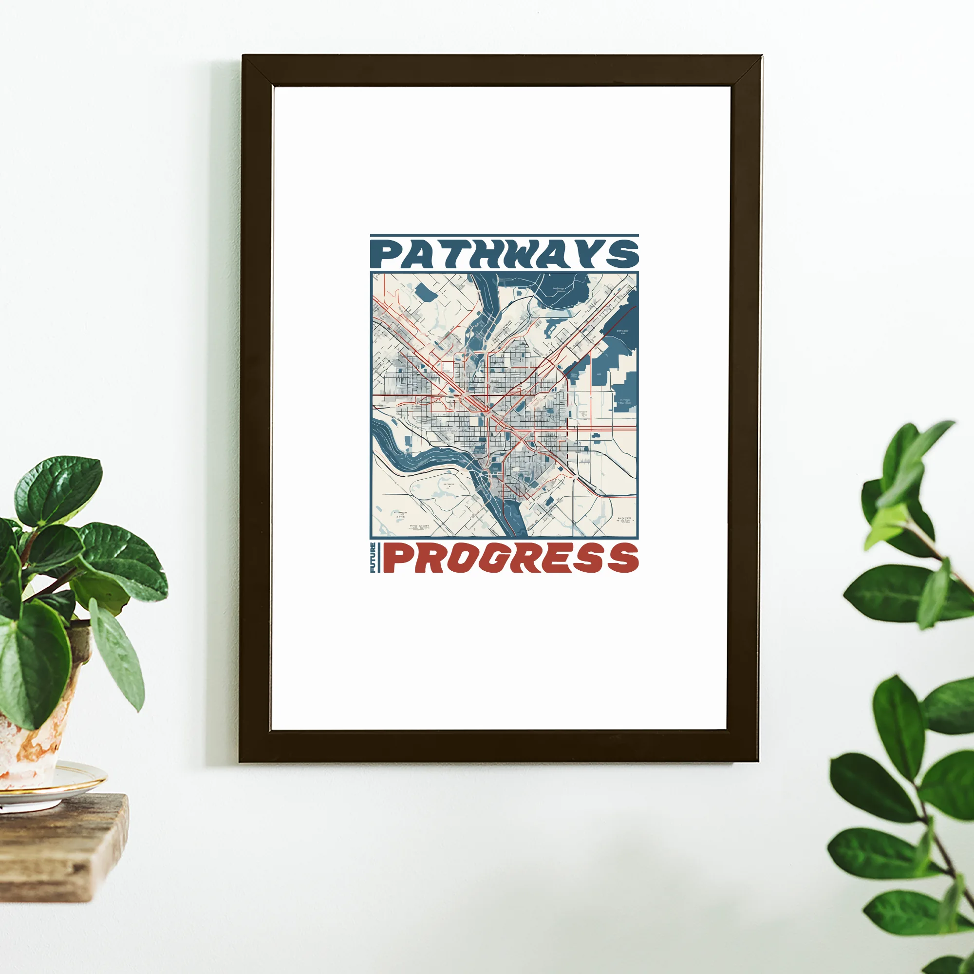
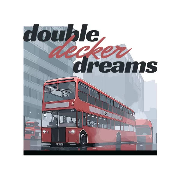
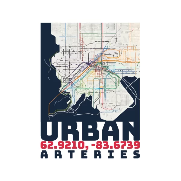
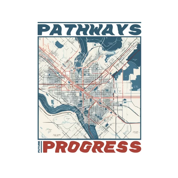
The design features a map of the city, showcasing the intricate network of streets and traffic routes. The main focus is on highlighting the pathways and routes for convenient navigation.
The design style is a combination of various elements, including a touch of femininity, urban aesthetics, simplicity, and a hint of adolescence.
The design caters to both girls and boys and incorporates illustrations to enhance the visual appeal.
The color palette consists of vibrant shades of red and blue, which add dynamism and energy to the design. Additionally, a subtle touch of beige is used to provide balance and sophistication.
Two types of fonts are utilized to create a distinct typography. The bold font brings prominence to essential information, such as street names and landmarks, while the display font adds a decorative touch to headings and titles.
The text “Pathway progress” serves as a prominent feature, conveying the concept of tracking progress or development in navigating the city’s pathways. It is strategically placed to attract attention and provide a clear indication of the design’s purpose.
