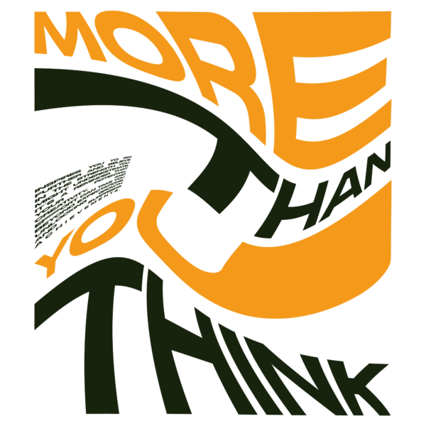

A bold, experimental poster that centers a warped typographic statement reading variations of “more than you think” rendered as oversized display words bent along curved paths, accompanied by a small block of microcopy; the design uses a heavy condensed/display style for the main words and a compact sans for the microcopy. The three dominant colors are vivid orange (large letterforms), deep olive/forest green (secondary letterforms and accents) and white (background/negative space). Visual treatment is flat and graphic with strong baseline warping, carved negative gaps, and rhythmic wave-like paths—no gradients or textures—relying on extreme scale, curvature and color contrast for impact; the result reads modern/experimental with retro graphic nods, formatted as a vertical/square poster optimized for print.

")
")
")
")
")
")
Orange and olive distorted poster typography design
A bold, experimental poster that centers a warped typographic statement reading variations of “more than you think” rendered as oversized display words bent along curved paths, accompanied by a small block of microcopy; the design uses a heavy condensed/display style for the main words and a compact sans for the microcopy. The three dominant colors are vivid orange (large letterforms), deep olive/forest green (secondary letterforms and accents) and white (background/negative space). Visual treatment is flat and graphic with strong baseline warping, carved negative gaps, and rhythmic wave-like paths—no gradients or textures—relying on extreme scale, curvature and color contrast for impact; the result reads modern/experimental with retro graphic nods, formatted as a vertical/square poster optimized for print.
$6.00