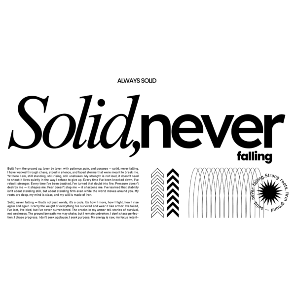
This horizontal print composition centers a large typographic statement — main headline “Solid, never” with a small prefatory “ALWAYS SOLID” and a dense paragraph of supporting copy — paired with geometric motifs (chevrons, arched lines and a sunburst emblem). The layout contrasts an elegant, slanted serif for “Solid” with a heavy, modern sans for “never,” creating clear typographic hierarchy. The three primary colors are black for text and marks, white for the background, and neutral charcoal/gray used in fine accents and icon strokes. Visual treatment is flat and editorial: crisp vector fills, high-contrast negative space and precise linework (no gradients or textures), relying on scale, weight and simple graphic icons for interest; overall the piece reads as modern, minimalist-editorial typography in a horizontal format ideal for posters or apparel prints.

")
")
")
")
")
")
")
Minimal black and white typographic composition design
This horizontal print composition centers a large typographic statement — main headline “Solid, never” with a small prefatory “ALWAYS SOLID” and a dense paragraph of supporting copy — paired with geometric motifs (chevrons, arched lines and a sunburst emblem). The layout contrasts an elegant, slanted serif for “Solid” with a heavy, modern sans for “never,” creating clear typographic hierarchy. The three primary colors are black for text and marks, white for the background, and neutral charcoal/gray used in fine accents and icon strokes. Visual treatment is flat and editorial: crisp vector fills, high-contrast negative space and precise linework (no gradients or textures), relying on scale, weight and simple graphic icons for interest; overall the piece reads as modern, minimalist-editorial typography in a horizontal format ideal for posters or apparel prints.
$6.00