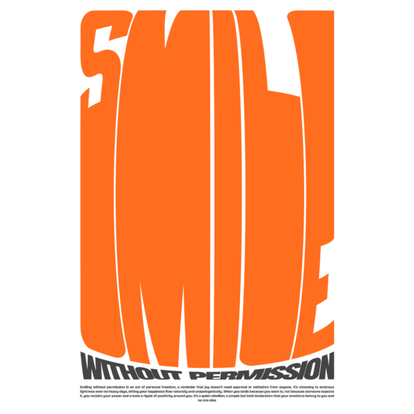
A bold, minimal poster built around an oversized, vertically stretched display word “SMILE” (or equivalent headline) that dominates the composition, paired with a curved/arched caption beneath and a block of microcopy at the foot; the lettering reads like a condensed slab-display with exaggerated vertical scale and tight tracking, contrasted by a compact sans for the microcopy. The three main colors are vivid orange (headline), dark gray/charcoal (caption and microcopy) and white (background/negative space). Visual treatment is flat and graphic with clean cutouts and slight curvature in the baseline, no textures or gradients, relying on extreme scale, negative space and subtle baseline warping to create impact; the style reads modern with retro/70s influences, and the layout is square/vertical optimized for print.

")
")
")
")
")
")
")
bold retro stacked lettering with microcopy design
A bold, minimal poster built around an oversized, vertically stretched display word “SMILE” (or equivalent headline) that dominates the composition, paired with a curved/arched caption beneath and a block of microcopy at the foot; the lettering reads like a condensed slab-display with exaggerated vertical scale and tight tracking, contrasted by a compact sans for the microcopy. The three main colors are vivid orange (headline), dark gray/charcoal (caption and microcopy) and white (background/negative space). Visual treatment is flat and graphic with clean cutouts and slight curvature in the baseline, no textures or gradients, relying on extreme scale, negative space and subtle baseline warping to create impact; the style reads modern with retro/70s influences, and the layout is square/vertical optimized for print.
$6.00